There are over 800 registered artists and thousands of works.
FROM ARTIST is a place where you can see and purchase a variety of art.
From north to south, from current art students to award-winning professional artists, a wide variety of artists from all locations and environments are registering and selling their works.
How long did it take to draw this picture?
What kind of experience does it take to be able to paint a picture like this?
Would you like to take a peek at the secrets and behind-the-scenes of production?
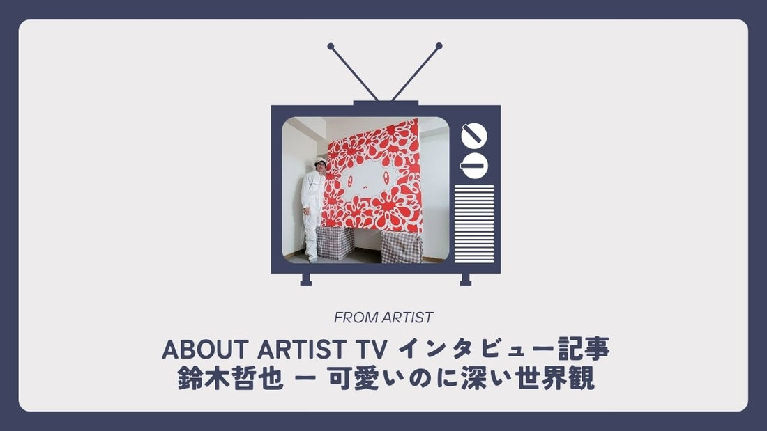
────────ABOUT ARTIST TV INTERVIEW────────
"Tetsuya Suzuki"
Hello everyone! Welcome to ABOUT ARTIST TV!
ABOUT ARTIST TV is an art channel run by the art marketplace "FROM ARTIST."
As some of you may already know, FROM ARTIST publishes an original magazine called "ABOUT ARTIST" that introduces artists' roots and their thoughts on their work.
This art channel is a rare opportunity to invite artists to speak directly to us about the thoughts they put into their work. Please enjoy until the very end.
All of the works introduced here are one-of-a-kind pieces currently for sale at FROM ARTIST.
If you see any works that interest you, please check them out using the links.
Now, we would like to welcome today's guest, Tetsuya Suzuki! Suzuki-san, we look forward to having you on the show!
Artist:
Thank you for inviting me today. I look forward to working with you.
──Self-introduction
FROM ARTIST Staff:
First, please give us a brief introduction about yourself!

Artist details page : http://from-artist.com/collections/suzuki-tetsuya
Artist:
I was born in Saitama Prefecture in 1968, and it has been two and a half years since I started painting. What got me started was a comment from a friend who asked me, "Why don't you try painting?" At first I painted pictures with a ballpoint pen on paper, but now I paint acrylic paintings on canvas and create three-dimensional sculptures.
FROM ARTIST Staff:
In fact, Tetsuya Suzuki is an artist who won the prestigious runner-up prize in the contest held by FROM ARTIST's open exhibition "A Journey Through Japan's 47 Prefectures! An Art Journey Throughout Japan" in Kanagawa, where the grand prize was decided by visitors' votes! Thank you very much for your support!
Artist:
Thank you very much. I never thought I would be selected, so it was a very valuable experience, and the award has given me a little bit of confidence. Thank you very much.

The 3rd "Traveling Through Japan's 47 Prefectures! Art Journey" in Kanagawa [Runner-up] Tetsuya Suzuki Interview Article here

Click here for the article FROM ARTIST INTERVIEW-Suzuki Tetsuya & Naminami-
──Introduction to the work
"Covered #129"

Product details page: https://from-artist.com/products/mamire-129
FROM ARTIST Staff:
Now, let me introduce the first work right away. The first one I'd like to introduce is this one, "Mamire #129"!
What thoughts and themes are contained in this work?
Artist:
When I decided to draw a picture, I first considered what theme I should use. Since I wasn't very physically strong since childhood, I decided to draw things related to the body, such as the heart, kidneys, red blood cells, and cells. At the same time, I hope to express the miracle of being born into this world and the joy of life. Actually, I didn't decide to draw a character from the start; I was staring blankly at an illustration of a heart I found online when the shape of this character came into my mind. So, I'll leave it up to the viewer to decide what they think, but to me, that character is the heart itself, and what looks like a flower is actually my abstract representation of a cell or red blood cell. But today, you can call them flowers.
FROM ARTIST Staff:
Thank you for the very interesting story.
Based on your own experiences, you have drawn on the themes of "heart," "kidneys," and "red blood cells," and have depicted the "joy of life." It's also fascinating to hear how the character was born while looking at an illustration of a heart.
I also learned that the parts that look like flowers at first glance are actually abstract representations of "cells" and "red blood cells," which broadened my perspective on the work. One of the charms of art is that it values the viewer's free interpretation.
This first piece has a bright red background that makes a striking impression, and the contrast between the central character and the colorful flowers is very beautiful!
Artist:
Thank you. I used Akela paints for the flowers in this piece, and last year I had the opportunity to talk with Tsumugi Fumitori, the guest on the first episode of ABOUT ARTIST TV, who told me about these paints. I think you just mentioned contrast, but I think the "solid red acrylic paint" and the "mixing of Akela paints" are also a form of contrast.
FROM ARTIST Staff:
You used Akira paints for the flowers! You learned about these paints through your connection with Fumitori Tsumugi and incorporated them into your work, but I feel that the difference in expressive technique adds even more depth to the work.
Are there any points you would like us to pay attention to?
Artist:
I hope you enjoy the mixed colors of the Akila paints in the flower part shown earlier.
FROM ARTIST Staff:
The clear outlines of the lines give the design a sense of depth despite its pop look!
Is there any reason or intention behind using a red background?
Artist:
My favorite colors are red and gold, and I use them often. Red represents the red of blood, and expresses the dynamic movement of life.
FROM ARTIST Staff:
It certainly conveys strength and vital energy!
Also, in this piece, the gradation of the petals is beautiful, and the range of colors seems to express emotion. Are there any special rules or meanings behind the way you choose the colors of the flowers?
Artist:
Thank you. This may be something that applies to all of my color choices, but I choose color schemes by being conscious of finding a good balance between "colors that viewers find comfortable" and "colors that viewers find uncomfortable" on the same canvas, while making the most of each color.
FROM ARTIST Staff:
So you're combining pleasant and unpleasant colors! That's why you might have been interested in the choice of flower colors... The idea of balancing each color while making the most of them is very wonderful. It conveys how you add depth to the work through the contrast of colors while also appealing to the viewer's senses.
So, what kind of room would you recommend displaying this piece in?
Artist:
I often get told that my work brightens up a room, so I think that if you display it as an accent color in a living room or entryway that has many white walls, it will instantly brighten up the room.
FROM ARTIST Staff:
People often say that their rooms have become brighter! This shows that the artworks bring a positive energy to the space. It's true that by displaying them as an accent color in a living room or entryway, which often has many white walls, they will stand out even more and instantly brighten up the room! They also make a great accent piece for interior decor!
"Covered #130"

Product details page: https://from-artist.com/products/mamire-130
FROM ARTIST Staff:
Now let's introduce the second work! This is "Mamire #130"!
So, what thoughts and themes are contained in this work?
Artist:
The overall theme of this work is the same as the previous one, but this is a large piece measuring S100. Painting on a large canvas is powerful in itself, and I think it is large enough to express the miracle of birth.
FROM ARTIST Staff:
You probably wouldn't know it at first glance, but this piece is actually a large piece, measuring 162cm in length and width, called S100 size! Suzuki-san, how long did it take you to create this piece?
Artist:
If I try to paint a large piece all at once, I get bored halfway through, so I've been painting other small pictures and doing other things, but I think it took about a month and a half. Because it's a simple piece, if I leave it out in a visible place I'll want to add to it, so for now I'm holding back and putting it away in a box to hide.
FROM ARTIST Staff:
Even after completing a work, you may find yourself wanting to make changes to it, which is only possible with a passion for creation. This piece is a simple yet very impactful work, and the two-color palette of red and white makes a strong visual impression. Is there any emotion or message you wanted to convey with this color combination?
Artist:
I wanted to express the powerful sense of life that red has, so I deliberately did not use any other colors and instead used only red and white to express the pure and straightforward vitality of a newborn.
FROM ARTIST Staff:
The strength and purity of life are accentuated by the simple use of colors! The concept of newborn vitality is conveyed very directly, without the addition of any other colors.
Are there any points you would like us to pay attention to?
Artist:
This is a large piece, so the big, simple eyes are especially important.
FROM ARTIST Staff:
The flowing lines of the petals give the piece a sense of movement, and even though it is a still piece, it feels like it has the breath of life. What story is there behind the situation surrounded by flowers?
Artist:
Thank you. The movement you just mentioned is exactly what I want to express. For example, even when a human being is simply sitting in a chair, blood is being pumped from the heart, old cells are dying, and new cells are being born - a very dynamic process that repeats itself every second. I would like to be able to express in my paintings the dynamism and beauty that is happening inside the body, the miracle of life.
FROM ARTIST Staff:
This movement is the essence of expression! When viewing a work, if you pay attention to the movement hidden within, you will be able to feel it even more deeply.
So what kind of room would you recommend displaying this piece in?
Artist:
This is a large piece, so I would like it to be displayed on the wall of your living room.
FROM ARTIST Staff:
Because it is such a large piece, its presence and charm will be even more pronounced when displayed on the wall of your living room! It is likely that you will discover something new and be moved every time you see it in your daily life.
"Covered #124"

Product details page: https://from-artist.com/products/mamire-124
FROM ARTIST Staff:
Now let's introduce the third work! This is "Mamire #124"!
So, what thoughts and themes are contained in this work?
Artist:
The theme of this piece also expresses the miracle and joy of being born into this world.
FROM ARTIST Staff:
The pop, colorful colors and unique character designs are very appealing! The characters blend seamlessly with the background, yet each character's facial expression and personality stand out, making you feel as if you've wandered into a mysterious, dreamlike world.
Artist:
Thank you. The flowers and the heart are not independent, but represent the deep connection between life. I wanted to express a sense of unity in this piece, so I used an airbrush to paint the gradation.
FROM ARTIST Staff:
This is an airbrushed piece! The smooth transitions of color give a more delicate feeling to the continuity and connection of life.
In fact, this piece is also large, measuring 162cm in length and width! How long did it take to complete this piece?
Artist:
Like the S100 piece mentioned earlier, this piece was created while I was working on other pieces, but there was a period of about two months where I didn't draw at all, so it took about five months to complete.
FROM ARTIST Staff:
It took about five months to complete! A work that has been completed over a long period of time surely has depth and power to it.
Are there any points you would like us to pay attention to?
Artist:
There are several characters, and although they may look similar, they are not the same. I hope you will find a character that suits your taste.
FROM ARTIST Staff:
I see! It's interesting that each character has their own unique personality. It's fun to find your favorite character, and viewers may also discover something new.
You can see the attention to detail in the work, and the more you look, the more new things you will discover. Do you make any rough drafts?
Artist:
I only sketch out the positions of the characters and flowers. I sketch out about 70% of the whole, and then I draw the remaining 30% based on my inspiration at the time while checking the overall balance.
FROM ARTIST Staff:
By keeping an eye on balance, the work surely exudes a sense of lively movement and natural harmony. I believe that this free-flowing imagination is what gives the work its unique charm.
So, are there any changes you made along the way, or any differences from your initial image?
Artist:
At first, I had decided to outline the characters in black, but I struggled with how to create a sense of unity, as if everything had blended together, and I spent about 10 days debating whether to go with black or white. In the end, I decided to go with white, and when I saw the finished product, I knew it was the right choice.
FROM ARTIST Staff:
Black or white... You were struggling for 10 days! That was quite a struggle!
So, what part was the most fun to draw?
Artist:
Finally, when I drew the white outline of the character in one go with a thick pen, it was fun because it felt like I was breathing life into a character that didn't exist before.
FROM ARTIST Staff:
You can really feel the joy and sense of accomplishment at that moment. It must be that important moment when the work is nearing completion that gives it new energy.
If you look closely, it looks like paint is dripping from the white parts of the character. Was this intentional?
Artist:
As I paint, my paintings tend to settle into a safe direction, so when I notice this, I intentionally disrupt the balance. This painting was also coming together safely, so I deliberately disrupted the balance and expressed the freshness of life with dripping paint.
FROM ARTIST Staff:
Deliberately disrupting the balance...As with the combination of pleasant and unpleasant colors mentioned earlier, it is very striking how this intentional disruption is an important element in expressing the freshness of life.
So what kind of room would you recommend displaying this piece in?
Artist:
This piece is also large, so I would be happy if someone would display it in a large living room or, although this is just my wish, in a hospital waiting room.
FROM ARTIST Staff:
Displaying these artworks in hospital waiting rooms could certainly energize patients and create a space that brings out positive feelings. The vitality and dynamism of the artworks could make the time spent waiting a little more reassuring and energizing.
"Covered #131"

Product details page: https://from-artist.com/products/mamire-131
FROM ARTIST Staff:
Now let's introduce the fourth work! This is "Mamire #131"!
So, what thoughts and themes are contained in this work?
Artist:
Yes, the main theme of the work is as I have explained so far, but this is my latest work.
FROM ARTIST Staff:
As this is the latest work, I'm very interested to see how it continues the themes of previous works while adding new elements!
The round canvas shape of this work gives a sense of gentleness and harmony, while the colorful flowers that fill the screen give it an overwhelming sense of splendor and vitality.
Artist:
Thank you. Personally, I like round canvases and think they are a good canvas for expressing gentleness and softness, and I think they go well with my paintings.
FROM ARTIST Staff:
I can totally see why you like round canvases! The round shape is perfect for expressing gentleness and softness. It's no wonder that it seems to go well with Suzuki's paintings.
Are there any points you would like us to pay attention to?
Artist:
This is the color scheme that everyone calls flowers, but if I only use my favorite colors, colors that I find comfortable, the picture will start to look small and cluttered, so I consciously use color combinations that don't go well together, or that make me feel uncomfortable.I use colors to express energetic cells and slightly depressed cells.
FROM ARTIST Staff:
I really find the way you think about color combinations very interesting! I think it's these kinds of subtle touches that create the depth of your work.
In this piece, the simple and adorable expressions of the characters create a contrast with the lively background, bringing a sense of calm and relaxation to the viewer! The translucent expression of the white flowers is also beautiful, and it's wonderful how it gives the entire piece depth! What is the meaning behind the difference between the white flowers and the colorful flowers?
Artist:
As humans, we have colorful days in our lives, but we also have periods of "white days" where we don't know if we're moving forward or backward. But when the painting is finally completed, it will be a beautiful one, so there's nothing to worry about. I expressed this with a positive message: let's live our lives making the most of the miracle of life we've been given.
FROM ARTIST Staff:
It's a work with a very deep message.
Unlike the works we've introduced so far, the eyes have a gradient. Is there any special meaning behind this?
Artist:
When you make eye contact with a character in the picture, depending on your psychological state, it may look like "sad tears" or "happy tears." I used gradations instead of solid colors because I thought they would give a wider range of expression, as a mirror that reflects your feelings at that time.
FROM ARTIST Staff:
The eyes of the characters act as a mirror that reflects the viewer's feelings. The fact that you can interpret it in a new way every time you look at it is one of the charms of art.
This piece uses a special round canvas. Was there anything in particular that you struggled with or found difficult during the production process?
Artist:
In the creative process, I haven't had any particular difficulties with rectangles, squares, or circles, but I do try to keep in mind a composition that suits the shape of each canvas when I paint.
FROM ARTIST Staff:
Thank you! So what kind of room would you recommend displaying this piece in?
Artist:
It's large, measuring 80cm in diameter, but the round canvas gives it a gentle atmosphere, so it might look good in an entryway, living room, or bedroom. The character's body is painted gold, so when the room is bright, it will shine depending on the angle from which you view it, allowing you to enjoy two different atmospheres: daytime and nighttime.
FROM ARTIST Staff:
Another appealing feature is that the characters glow depending on the angle you look at them from, allowing you to enjoy completely different expressions during the day and at night. Displaying them in your entrance, living room, or bedroom will add warmth and elegance to the space.
Thank you! I hope you now have an idea of how to decorate your room with these items.
──Finally
FROM ARTIST Staff:
Today we introduced many wonderful works by Tetsuya Suzuki!
Have you found any works you like?
Finally, may I ask Mr. Tetsuya Suzuki to say a few words?
Artist:
I am very happy to be able to introduce four of my works today. I am very grateful for this opportunity. Thank you very much.
FROM ARTIST Staff:
Thank you! Tetsuya Suzuki, who we introduced this time, has other fascinating works featured in FROM ARTIST. Please be sure to check them out as well!
Well, see you next time! Thank you!
Broadcast details URL: https://youtu.be/lEtBU7oAb34
#artmuseum #artmuseumtour #artmuseumdate #connectwithartmuseumlovers #connectwithartlovers #arttour #paintingappreciation #artappreciation #museum #exhibition #exhibitiontour #soloartmuseum #museum #museumtour #artevent #art #artstudent #soloexhibition #livingwithpaintings #livingwithart #artposter #connectwithartlovers #artcollector